Part 5: Make your website pretty
In Part 4, you learned how to add new content to the blog on your website. Now that you know how to add different types of content, let’s take a look at how you can make your website truly your own with your favorite colors and other design improvements.
Change the color of links on your website
In previous parts, you learned the basics of HTML. We called HTML the language of the web as it helps us define the content and structure of websites. When we want to style various HTML elements, we use another language — CSS.
It’s a good practice to keep your content separated from design, which is why your Jekyll project saves stylesheet files in its own folder. To be more precise, you can find the files that define your website’s design in the folder called css.
If you look into the folder css, you’ll see the file main.scss, which defines basic design settings. Open the file in Sublime and find the line that starts with $base-font-family: and change the entire line to:
$base-font-family: "Merriweather", "Helvetica Neue", Arial, sans-serif;
Don’t forget the semicolon at the end of each line when writing CSS or you might get errors or unexpected results.
Now find the line that starts with $brand-color: and set the value to #27ae60. This line should now read:
$brand-color: #27ae60;
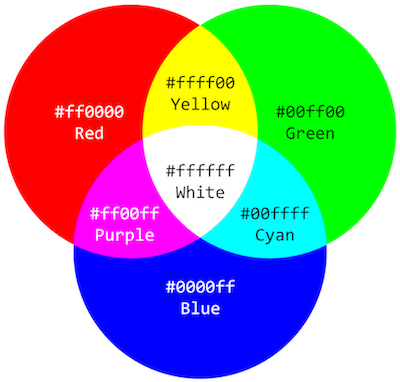
Wait a minute, what’s with this mysterious color code? In CSS you can use common color names such as red or blue, but if you want to pick a more specific shade, you’ll use HEX color codes.
Putting a hex on your favorite color
Hex color codes start with a hashtag, followed by values for red, green, blue in hexadecimal values. Sounds complicated? Don’t worry, you can easily find HEX color pickers that help you find the right HEX code just for the color you want.
Save the style file and reload your website. You’ll see that all links on the page turned into a green color! Don’t like green? Use the color picker website to find a better color. Flat UI colors is another website that offers cool color pallets for your website.
If you’re feeling curious, try playing with $text-color and $background-color as well. It’s your website, you can paint it in your favorite colors!
SCSS? CSS?
Ok, we’ve got a confession to make. We promised you’d be using CSS for design, but we have only shown you how to edit a style file written in SASS. That is why the file we were just editing ends with .scss and not .css.
Here’s the thing: CSS is the design language of the web, but it can be difficult to write and maintain on large websites. This is where SASS comes in. SASS is a CSS extension language, which simply means that it makes working with CSS much easier. It allows us to define our favorite color once and use it as many times as we want for different elements. See how easy it was to change colors in css/main.scss?
If you don’t want to worry about design too much, you can use one of the Jekyll themes made by others. You can find the instructions on how to install new themes in the Jekyll documentation and on GitHub (we’ll use GitHub to publish your website in the next step).
But we’re sure you can build a better theme on your own. After all, it’s your website, and you want it to look just the way you want it to, right?
Build your own theme
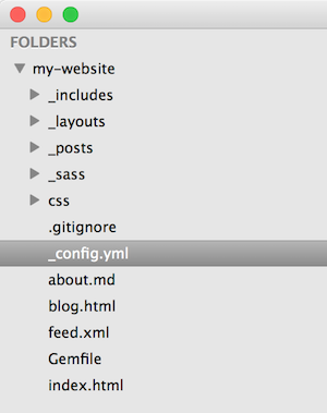
All right, we’re happy to hear you want to be in charge! If you look into the _config.yml file in Sublime, you’ll see that your website is currently using a theme called minima. Add a # in front of the theme to comment this part out, so we can override the default theme with our own settings (the last line of _config.yml should now read # theme: minima).
Next, download this .zip file, unzip it, and copy the following 3 folders into the folder where you are building your Jekyll website:
_includesfolder: this folder contains various website elements, like the footer and header that are included in the page template._layoutsfolder: this folder includes templates for different page types. If you click on the filedefault.html, you’ll see lines where the head, header and footer are called in._sassfolder: this folder includes a bunch of additional style files for the minima theme.
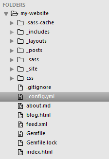
After you’ve copied the three folders, make sure to refresh your website and check the TerminalCommand Prompt for any errors.
_config.yml file, you'll have to restart your Jekyll website from the TerminalCommand Prompt. If you get any errors after you've copied the new folders from the minima theme, make sure the folders are placed in the same folder as the _posts, _site and css folders of your project, not inside an additional folder.
CSS basics
Ok, now we’re ready to learn a bit more about CSS. Defining styles is similar in both CSS and SASS. The general rule is this:
element {
	element-property: value;
}
For example, if we want to change the font size of all level 1 headings (remember the <h1> tag?) to 36 pixels, we can use CSS to write:
h1 {
	font-size: 36px;
}
Depending on the element we’re styling, we can change different properties. For text elements, we change things like font size, color, line spacing etc. For images, changing width and height is usually more relevant. On the website W3Schools, you can find a complete reference of CSS properties and values that you can use depending on what you want to style.
Don’t worry, you don’t have to memorize all of them, you’ll soon remember those that are most commonly used and Google the rest (seriously, we all do this!).
Defining custom CSS classes
Often, you don’t want to change the style of all elements, but just a certain group that has a certain role on the page. In this case, we can add a custom class to a HTML element. Usually we do this to <div> elements that are used for blocks of content.
Let’s say we want to use some blocks of text to display warnings. We want the warning blocks of text to be written in red text.
First, we have to define the type (class) of block in HTML:
<div class="warning">This will be a warning and it should be red!</div>
Now that our block of text, enclosed with the <div> tag, has the class “warning”, we can use CSS to display the warning text in red:
.warning {
	color: red;
}
This is similar to what we did before with the h1 element, but because “warning” is a class we made up, it has to have a dot in front of its name in the CSS file.
You can reuse this class anywhere on the page. All the blocks with this class will be displayed red.
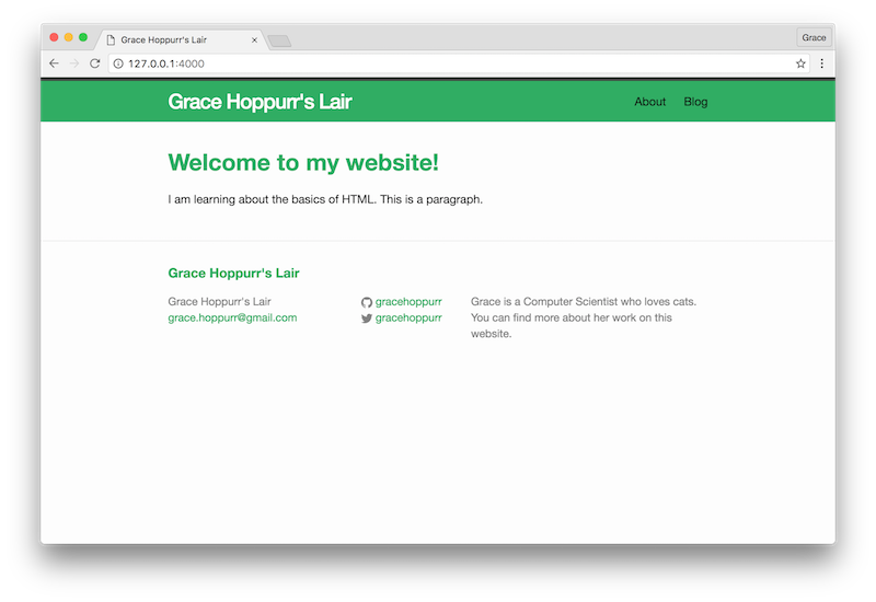
Change the website header color
Speaking of colors, don’t you think your website could use a bit of color in its header?
Open the file _sass/minima/_layout.scss and find the line .site-header. Between the brackets ({}) add another line to change the background color:
background-color: $brand-color;
Save, refresh, and voila! The same color we’ve used for links is now automagically used in the background of the header.
If you’ve used a stronger color, your thin website title now looks a bit lost in the background. To make it white and bigger, find the line .site-title. Let’s add a bit weight to it by increasing font-weight from 300 to 500:
font-weight: 500;
Make the size of the title a bit bigger:
font-size: 28px;
And also change the color in the following lines to white (the HEX color for white is #ffffff):
&,
&:visited {
    color: #ffffff;
}
.site-title should now have the following attributes:
.site-title {
    font-size: 28px;
    font-weight: 500;
    line-height: 56px;
    letter-spacing: -1px;
    margin-bottom: 0;
    float: left;

    &,
    &:visited {
        color: #FFFFFF;
    }
}
Let’s make those headings even more stylish
Headings on a website are special, so they deserve a bit more style. Open the file css/main.scss and add the line:
$heading-family: "Montserrat", "Helvetica Neue", Arial, sans-serif;
You can add this after the $base-font-family: line. You can use this approach whenever you want to add general website variables that you want to reuse, just make sure to use variable names that don’t use spaces. You can separate multiple words with dashes (the same goes for longer class names).
Now, let’s reuse the same color the links use for all headings on the website. Open the file _sass/minima/_base.scss again and find the section:
/**
 * Headings
 */
You’ll see that one line lists headings from level 1 to 6. We want to change the color for all of them, and while we’re at it, we’ll also change the font used and the thickness of the font (defined by the property font-weight). This will be the result:
/**
 * Headings
 */
h1, h2, h3, h4, h5, h6 {
    font-family: $heading-family;
    font-weight: 700;
    color: $brand-color;
}
For the font, we used the variable $heading-family that we defined earlier on and the color was changed to get the value of $brand-color that we also changed. If you go back and change $brand-color in the file css/main.scss, the heading color will also change automatically.
Confused by all the different folders? Don’t worry, you’ll get used to finding the right thing with practice.
And don’t forget to save any file you edit and refresh your website in the browser to see the results. Don’t like what you see? Feel free to play around and experiment with different colors and other attributes! Have fun!
Bonus points: meet Bootstrap
If you want to learn a cool trick that can help you make prettier website designs faster, we’d like to introduce you to a little tool called Bootstrap. Feel free to skip this part and return back to it at a later time.
Bootstrap is a framework that comes with a wide range of pre-defined styles for common website elements like buttons, web forms and more. It’s very popular among web developers. It also makes it easy to build websites that work well on a wide range of devices, from desktops to smaller screens on phones (you might have heard about this thing called responsive web design).
How are all styles connected to your website?
Your website has to be told where design styles are saved. If you look in the file _includes/head.html, you’ll find this line:
<link rel="stylesheet" href="{{ "/css/main.css" | prepend: full_base_url }}">
The <link> HTML tag is used to define links between your website and other files. In our case, the link points to the folder css and its file main.css. You could also use the <link> tag with the right path in the file _includes/head.html to include a CSS file from somewhere else. The order in which stylesheet files are linked in the website head is important. You should include the most general files fist, and specific files that override general styles later (you’ll see that with Bootstrap very soon).
Right now, your website is told to only look at /css/main.css for styling advice. You’ve already edited the css/main.scss file to change the main color used on your website. At the end of the file, you’ll also find the line @import "minima"; that tells your website to also look at the file minima.scss in the _sass folder. If you then look at the file _sass/minima.scss, you’ll find additional @import lines. For example, the part "minima/base", imports the file _sass/minima/_base.scss that you edited before.
This sounds almost like a soap opera! We promise that this structure isn’t completely random. Different elements of your website are separated in smaller files to keep things organized as your website grows in size. Right now it might seem like an overkill to have all these different files, but once you start defining more styles, you’ll see it makes as much sense as keeping socks in a different drawer from your underpants. The thing to remember is that you have to make sure to @import new style files if you add them to the _sass folder. Just like you’d add a new drawer to your wardrobe if you decided you need to separate summer socks from winter socks.
Add Bootstrap to your website
There are different ways to add Bootstrap to your website. You can copy the latest SASS version to your _sass folder (hint: remember the @import), but we’ll choose the faster way and link to an online version. You can find out more about other approaches on the Bootstrap page.
But let’s just go with the easy way of adding Bootstrap. Open the file _includes/head.html and add the Bootstrap link right before the <link> tag that points to our local CSS file. You should now have two links (the order is important):
<link rel="stylesheet" href="https://maxcdn.bootstrapcdn.com/bootstrap/3.3.4/css/bootstrap.min.css">
<link rel="stylesheet" href="{{ "/css/main.css" | prepend: site.baseurl }}">
If you save the file and refresh your website, you’ll only notice minor differences. Let’s add some Bootstrap elements to our page!
Add a Glyphicon
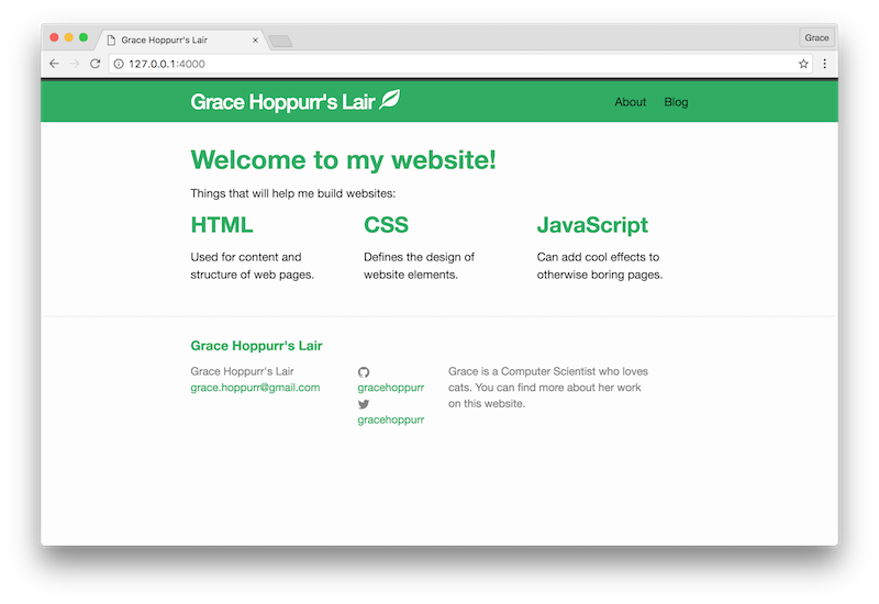
Find an icon you like on the Bootstrap page and copy its class names somewhere. For example, if you like the leaf icon, you’re going to need the class names glyphicon glyphicon-leaf.
As we don’t have a logo, we’ll add it to the site title to make it stand out a bit more. Open the file _includes/header.html, find where the title is displayed and add an in-line text tag with the name of the Glyphicon (icon) you want to use, for example:
<span class="glyphicon glyphicon-leaf"></span>
The tag doesn’t have any content as we’re just going to use it to display the icon, but it’s important to close it with </span>.
You should now have a line like this:
<a class="site-title" href="{{ site.baseurl }}/">{{ site.title }} <span class="glyphicon glyphicon-leaf"></span></a>
Save, refresh, enjoy your new icon. Have fun adding more icons to other parts of the website. Perhaps to the navigation menu?
Get to know the Bootstrap grid system
One of the really cool things that Bootstrap makes easy is displaying content in columns that adjust to the width of the browser. On a desktop, you may want to display your content in three or four columns, but you want to shrink all that down into one on a mobile phone screen.
Bootstrap makes this easy with the built-in grid system that divides the page into up to 12 columns. All you need to do to take advantage of this is use the right class names. You can find more examples on the Bootstrap page.
Let’s take a look at a simple example. Open the file index.html and add the following content anywhere you like:
<p>Things that will help me build websites:</p>

<div class="row">
	<div class="col-md-4">
		<h2>HTML</h2>
		<p>Used for content and structure of web pages.</p>
	</div>
	<div class="col-md-4">
		<h2>CSS</h2>
		<p>Defines the design of website elements.</p>
	</div>
	<div class="col-md-4">
		<h2>JavaScript</h2>
		<p>Can add cool effects to otherwise boring pages.</p>
	</div>
</div>
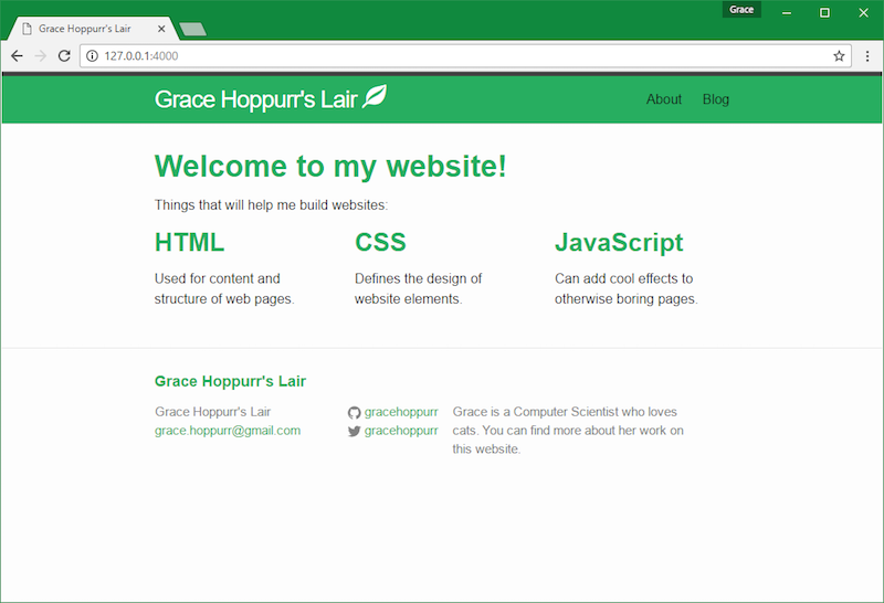
Save, refresh the website. You’ll see three perfectly divided columns. Try stretching your browser window and observe how the width of columns changes with the size of the windows. If you make the window narrow enough, the content will collapse into a single column. This is responsive design!
And all you need to make your content responsive with Bootstrap is define rows (<div class="row">) that include more <div> elements with classes that define how much room they can take on page (class="col-md-4"). All you have to keep in mind that the maximum number of columns is 12. Try changing all <div class="col-md-4"> from the example above to <div class="col-md-3"> and see how that affects the layout of the page. Again, feel free to play around and experiment!
What did you learn?
You've learned the basics of CSS, the design language of the web. This allowed you to add more color to the website. You also know about Bootstrap, a cool tool that can make designing website easier and faster.In Part 6, you’ll learn how to publish your pretty new website online, so you can share it with the whole world.